Blog Archives

All AAA Games Should Also Be Edu-Games

I know a lot about guns. I’ve never held a gun. I’ve seen guns only on store walls and on the hips of officers. I’m not interested in guns. Still, I know a lot about guns because guns play a big role in many of the videogames I love.

As a game designer specializing in educational games, I think a lot about how effective games are as teaching tools. Raph Koster’s book “A Theory of Fun” lays out the persuasive argument that ‘fun’ is the sensation our brain triggers as a reward for having learned something. It follows that all games teach the player…something. Sometimes they teach us how to manipulate systems that have no bearing outside the game itself. Sometimes games have a point of view to convey to the player, what game scholar Ian Bogost called ‘procedural rhetoric’. Sometimes they teach a mishmash of unexamined things, served up by designers whose only guiding principle was the ‘rule of cool’.

I am fascinated by the rare cases when a game without explicit learning goals manages to teach a segment of their players something which is true and meaningful in their lives.

I’ve heard lots of stories of language learning in games, simply because the game they were enchanted by wasn’t localized to their native language. I’ve heard people say they learned a lot about mathematics and economics by playing with the resources in games that engrossed them. Sometimes the setting and background details of a period game go a long way towards teaching history (or teaching history wrong when it’s inaccurate).

We live in a time of games with truly grand scale and ambition. Many such games include a diagetic game, like Poker in Red Dead Redemption, or Gwent in The Witcher 3. Some include a huge array of collectables—perhaps for their own sake, or perhaps useful to some other system of crafting or trade.

My argument is that AAA games should use these (often optional) sub-games to teach the player something real, and perhaps even something academic. I see three major benefits to this.

First, AAA games have a massive audience, so even if only the most committed players truly explore and master the educational systems embedded in the game, that is still an incredible number of people who will have been enriched not only by the sensation, the spectacle, the story, and the emotion of the game, but in an intellectual way as well. So, you could do it just because it’s a nice thing to do.

Second, you no longer need to make as much stuff up. Fleshing out your world with invented details is a lot of fun, especially when you need the setting to feel fantastical, but it also takes time and energy that might be better used at the core of your game. Why not use real stuff instead? Need a plant that has a medicinal effect on injuries caused by fire damage? How about aloe? Need an animal companion that can fly, fetch things, mimic sounds, and is smart enough to help solve puzzles? Instead of a fairie sprite, why not a crow? And if you need a world to feel unfamiliar and therefore explore-able, allow me to assure you there are plenty of phenomena in physics, biology, chemistry, linguistics, and social science that are weird, unintuitive, and alien. And as someone who has worked with many subject matter experts in the course of my career building learning games, let me tell you that subject matter experts would be thrilled to help you find the right examples. And they work cheap!

The last benefit is, I think, more salient to a AAA studio’s chief concern—the bottom line. Games, especially big-budget games, are still seen by many as a waste of time at best, and an active detriment to the player’s life at worst. That said, a little bit of learning content goes a long way. There are a fair number of parents who can justify their child’s hundreds of hours logged in Assassin’s Creed by the fact that they come away from the game talking about Renaissance Italy or the American Revolution.

Adding learning content can improve the reputation of the games medium in the long term, but also your game in particular in the short term. How many games can say they let their players learn and explore bee behavior, or superconductivity, or depression-era hobo sign? Very few. But yours could, and it could be the selling point that brings more players on board, and prompt the press to cover the game from a more flattering angle.

A screenshot of a made-up plant from Horizon: Zero Dawn, which is medicinal, beside the most similar-looking real-world plant, which is poisonous.

Let’s assume you’re sold. You’re cooking a big beautiful new game stew, and you want to add a pinch of learning to the mix. How would you go about doing it? I’m biased, but I think the best way could be to bring a designer who specializes in learning games onto the team (cough cough contact below cough). If that’s not an option for some reason, think about what kinds of learning goals might be idiomatic to the systems you’re already building. If you think your players will be crafting armor, for example, you could consider teaching more about metallurgy. Then reach out to a subject matter expert. Faculty websites often make their work emails public, and they are usually delighted to chat and to point out further resources, if not to sign on as an advisor. You might also want to seek out a pedagogy expert, aka a teacher, to help figure out your ‘scope and sequence’ (how much to introduce to the player and when).

The beauty of learning games design is: that’s really it. The process of tutorializing learning content is the same as tutorializing any other game system. The process of designing a clever educational puzzle is the same as for designing any other puzzle. The process of writing engaging NPC dialogue about a real-world topic is the same as writing engaging NPC dialogue about anything else.

I hope that, for those of you who work in AAA, this has been a persuasive post, and you’ll consider adding educational stuff to your game, or at least thinking a bit more deeply about what your game is already teaching.

Bobby Lockhart is a multi-award-winning designer of learning games based in Chicago.
Connect with him on LinkedIn: https://www.linkedin.com/in/bobbylox/

My Thoughts on Convergence Station

Some Background

A few years ago I stumbled upon the amazing advertising for OmegaMart. It produced a sense of the uncanny which I found both funny and intriguing.

I quickly became obsessed and learned all I could about OmegaMart and Meow Wolf, its creators. As a person who loves and seeks truly original and artistic immersive experiences, I felt I absolutely had to go. I was also fascinated by the story of this ragtag group of Santa-Fe avant-garde art scene rejects who came together to create themed experiences to rival Disney and Universal. Of course I watched the documentary, always trying to learn more ways to make whimsy and creativity into sustainable pursuits.

When my wife and I planned our next trip, it was to Las Vegas. Visiting OmegaMart really was life-changing. I was fully dazzled, and was even more determined to incorporate these kinds of experiences (which I dabbled with in the world of alternative controllers, VR, Museum Installation Games, and in co-organizing Bit Bash years ago) into my game design practice.

This was a short experiential game I co-created which has been shown at festivals around the world.

When I got home I planned a slew of new IRL and Alt.Ctrl projects, including my wife’s brilliant idea to make a laser maze on our front lawn for kids to navigate on Halloween, which was a great success.

Naturally, I couldn’t wait to get another slice of that deliciously weird Meow Wolf pie.

Getting to Convergence Station

Last week, my wife and I traveled to Denver — we had both been feeling a bit burnt out and needed to get away. We’ve developed a strategy for vacationing which is to find a place that has a mix of Outdoor Activities, mainly for my wife (though I love them, too!) and cool spots in the Built Environment, mainly for me (though she likes them, too).

Convergence station was the last activity after a week in the Denver area — hiking, snowshoeing, skiing, a case of the flu, dogsledding, snowmobiling, those were all done. As was an awesome visit to the Denver Art Museum the day before.

When we visited OmegaMart, we mainly just took in the sights and sounds. I had heard that there might be a story, but my first brush with this high quality high-key maximalism was too overwhelming for me to try accomplishing anything other than keeping my composure. However, this time I thought I could handle it. In retrospect, this might have been a mistake.

What was Awesome

I absolutely loved the placemaking of Meow Wolf. Walking out onto C Street was incredibly immersive and mindbending. My wife remarked that someone should write a science fiction movie to be filmed there, and I agree. As filmic production design, it would be incredible, and it even includes tiny details and full 360-degree views which film sets almost never have.

There are a few fun and silly things around to play with. On C Street are a few games — the Voting game and the Full-body minigames. There’s also a directory to call up short videos of the occupants of The Gyre, the main apartment building in the Convergence.

As always, there are lots of small unrelated spaces which are positively breathtaking. Notable for me was a short hallway of small dioramas within obsolete electronics, a small room with hanging knit eyeballs, Pizza Pals Playroom, a fictional Pizza-themed FEC, and transcendently the Gremlin Symphony (an orchestra of automated musical instruments and lights arrayed around a room filled with highway signs and industrial trash).

Meow Wolf’s ability to find and nurture artistic talent in service of an immersive experience is unparalleled. There were so many awesome things that I can hardly list them all, especially not without spoiling the experience for people who may with to visit. I Highly Recommend you see it for yourself.

What was Less Awesome

I’ll start by saying that none of these things reduced my respect for the incredible creators of Meow Wolf. A lot of this is stuff you can only learn after you build it. This is why video games are such an iterative process. Unfortunately, iterating on an IRL themed experience is prohibitively expensive, at least in the short term.

Also, this is the perspective of a creator of experiences. I only see lost potential because the potential of a place like this is so massive, and I can feel it.

  1. The Theme is not Subversive

In OmegaMart, and I gather in the House of Eternal Return, the experiences start with something familiar and then bend it slightly, then twist it beyond recognition. You step inside a supermarket, then you notice that each of the products has something wrong about it. Then you notice there is a door to another space, and you realize that things are going to get weird.

In Convergence Station, you begin in an elevator which opens up into an alien street with signs for their mythical Quantum Department of Transportation, an organization which features heavily in the story and which gives the whole experience its name. It is immediately crushing in its maximalism. I believe they mitigate this in part by having more areas where guests can be less overwhelmed, and even sit down and have a rest, than OmegaMart did. However, this does not counteract the lack of feeling expectations subverted. When you enter C Street, you can have no expectations, and therefore nothing you see as you travel further is surprising.

2. The Space is Not Very Interactive

Other than taking in the spectacle of their otherworldly design, most spaces within Convergence Station did not have much to do. The main verb of a Meow Wolf experience is exploration, which I love. As game-player personality types go, I am all about immersion. Unfortunately, Convergence Station seems to have a lot of Breadth to explore and not a ton of Depth.

There is a nature-focused realm within the exhibit, which we are told is a fragment of one of the four converged worlds, “Numina”. This is the area that feels most alive, though we know that the vines are felt, and the rocks are plaster. However, there are several creatures around the space (a Sloth-looking animal, a four-limbed and four-headed thing, a very Ghibli-esque elongated dragon-thing, and many others). These creatures are even sold in plush versions in the gift shop, because their character designs are very appealing. But they don’t move or make a sound, and don’t interact with the guests in any way, so it’s hard to imagine forming any kind of attachment to them. This, I think is a mistake — if immersion is a goal, then there has to be some nod toward the life of these beings.

I’m not asking that they be replaced with animatronics. There are lots of ways to bring these characters to life: Add projection-mapping, Give them Sleeping sounds coming from internal speakers, or convert them into in-world statues of absent creatures. Anything to make us feel that we are not merely walking around a sculpture garden. My dream would be for these to be puppeteered by castmembers live — speaking and reacting with us, but that is an expensive proposition, of course.

There were actors walking around in character, addressing large groups of us and activating features of the environment. These folks were cool, but they were very human, and I could not place them as occupants of this world. These actors don’t seem to be portraying any of the people mentioned in the story, though there are many characters in the story they *could* play. They also acted mostly as another sort of broadcast channel, performing for those present, but not really expecting anything from the guests in return.

There were a few games I mentioned earlier, as well as many other things one could interact with through our RFID (“Boop”) Cards including the main story, but I cannot imagine Convergence Station without the Boop Cards — or maybe I can. I later learned that these were supposed to cost money, though a castmember wordlessly handed me one for free when I asked about them (Thank you, unknown QDOT Worker!).

3. The Story Takes Away Almost As Much As It Adds

Overall, I really enjoyed the scavenger hunt aspect of Convergence Station — it added another layer of indentification with the characters and things we saw throughout the exhibit. It even added a sort of conflict that we were happy to help resolve.

To experience the story, guests needed to scan their Boop cards at various stations, collecting random MEMs (memory fragments) and periodically unlocking animated memories. These stations all look alike, and are placed in approximately the same places on walls or desk surfaces. Their predictable locations and appearances made it not so much a matter of searching the whole room with your eyes, but of scanning a very particular height around the perimeter. Finding these stations is easy, but looking for them is distracting. If entering each room starts with scanning for Boop stations, you aren’t really taking in the space the way it was meant to be encountered, and finding them doesn’t add much depth, other than what the story offers.

I’m not sure there’s a solution for this problem, as guest accessibility is important, but I recognize that it is one. There were a few more places the Boop card could be used, but their effects were momentary and inconsequential (I did like the slimes, but they were a bit frustrating and ultimately amounted to not much).

The story itself was cool, but I’m uncertain whether going to different stations was important. We scanned several stations twice and received different MEMs. There was even a room where MEMs could be called up by number. I wish that had been a bit clearer.

Regardless, gathering all the necessary MEMs took far too long. We ended up spending 5 hours at Convergence station, and crossing many rooms again and again until it began to feel like a chore. Perhaps it was my hubris for trying to both explore the whole space and experience the story — doing just one or the other would have probably taken half the time.

4. There were a lot of Regular People

This is an inescapable problem with all themed experiences, but sometimes the other guests fully pulled me out of the experience. There were a lot of kids and parents the day we visited who treated Meow Wolf as an FEC like Chuck-E-Cheese. And when you get down to brass tacks it kind of is. It’s very diverting for kids and kids-at-heart, which for a weary mom is a great excuse to talk about your life with your weary mom friends. Unfortunately, that’s not really supportive of the supposedly alien atmosphere. I don’t know if a solution exists for this kind of thing, but I suspect that involving the whole family in some kind of interactivity, or making more clear “break areas” where people can sit outside the Magic Circle, might be effective.

Beyond that, there are some bottleneck places which need to be Booped for story reasons, and one in particular at the end. Those tended to accumulate people especially towards the later part of the afternoon, as people were reaching the story’s climax. It feels a bit odd to queue up to save the world.

Horrible Pizza Creature

Final Thoughts

As I’ve said many times now in different words, the people at Meow Wolf are absolute geniuses, and seem to be utterly alone in their field. I’d give a lot to be able to work with them (or for some future competitor, if one emerges), and so much about it was so inspiring that my mind still reels to think of it all. Convergence Station is sure to influence both my work and my side projects, as OmegaMart has. If I ever do get the opportunity to work on any kind of immersive exhibit like this, I will hold dearly the lessons I have learned from Meow Wolf.

Category: Uncategorized

5 Radical Ideas for Dialogue Systems

Allow me to start by saying that I mean no disrespect to Dialogue Trees.  I don’t think dialogue trees can or should be replaced.  They are an art form of their own — a perfect compromise among the competing forces game developers require from such a system: Easy to predict, to implement, to hook into other systems. Enough choice to give the player a sense of free will, without having to account for every contingency.  The first two of my radical proposals below are essentially innovations on the dialogue tree.

There have been variations on the dialogue tree in the past, of course. Two pre-existing innovations that come to mind are Time Limits and Interruptions.  In a way, you can think of both as interruptions, where either you’re interrupting the game, or the game is interrupting you.  These days the freshest examples of dialogue trees with time limits are found in the Telltale games.  A recent game where you can interrupt the game is Westerado (in this case you interrupt with bullets).

With that out of the way, let’s dive into these radical ideas for dialogue systems.

1. Symmetric Dialogue

As we know from Richard Garfield’s book Characteristics of Games, a symmetric game is one where all players (or computer players) have all the same information.  For most dialogue trees, the process of choosing what to say is invisible to the NPC you’re speaking to.  You can think about the process of choosing an option as similar to the normal cognitive process of deciding what to say, so it stands to reason that your interlocutor wouldn’t have much information about the options NOT chosen.

RadicalDialogueSystems

But imagine if the NPC could see all the possibilities you might say, as well as the one you actually chose.  Imagine if NPCs had visible options, too, which you could WATCH them choose from among.  What if you could see the look on their face as they read and considered each choice?  What if they could be offended at the choice you made, given the other options?

"Why didn't you pick the one where you tell me I'm cool?  Do you not think I'm cool?"

Sure, this seems very artificial, but games always make tradeoffs between artificiality and realism.  There’s certainly room for games that are metatextual and self-aware enough to support this kind of dialogue system.

2. Trees Within Trees

The idea of dialogue trees is that with imperfect information, the player uses choices to Build a conversation.  It’s like doing a binary search (or tertiary, quaternary, etc. depending on how many choices there are at each step)  through a conversation to find the story they want.

RadicalDialogueSystems2

Well, the idea of Trees within trees is that the player uses choices to Build a single utterance.  Here, the player will search through phrases to find the thing they want to say.  Before they have ‘said’ anything, the player is already engaged with the process of composing a remark.  With variable length phrases, it allows the writers to fall back on simple dialogue trees when necessary.  Also, if you want to be extra kind to the player, allow them to backtrack and explore all the avenues before they submit their utterance.

I admit that this is hard to write for, since what this amounts to is many more options for the player and thus many more possibilities that will have to be taken into account, but surely clever designers such as yourselves will find ways to mitigate the fluffiness of the possibility space by making choices which are essentially equivalent, making them later converge, or loop back on themselves, etc.

3. Magnetic Poetry

This is almost a halfway step between a dialogue tree and a free text parser.  The designer controls the player’s vocabulary — and potentially the length of the overall comment — but the player chooses the permutation they will put the given words in.  This causes combinatoric explosion problems, in that the player can place the words in any order and the number of possibilities can be enormous for relatively few words.

RadicalDialogueSystems3

Luckily, English grammar is pretty restrictive (not as true of other languages like Russian), so the number of possibilities which actually make sense will be relatively small.  With a little skill, you can make some of the possibilities more-or-less semantically equivalent, and suddenly the combinatoric explosion looks more like a combinatoric poof.

4. Free Text Parsing of an Imprecise Language

OK, hear me out….  Emoji.  By ‘Imprecise Language’ I mean emoji, or something similar.  The problem with free text input parsers of English or another Natural Language is that there will inevitably be some unanticipated inputs which are clearly comprehensible to any literate human, and yet completely baffle the system.  This breaks the expectation that the parser is working somewhat like a person reading chat messages.

The beauty of giving the player complete freedom within an imprecise language like Emoji is that it’s perfectly rational that the other characters in this interactive story might not know what they’re saying.  Heck, another human player might not know what you mean by a string of emoji.

RadicalDialogueSystems4

This reminds me of the principle I’ve heard many times regarding enemy AI in games — it helps to set expectations low by making the enemies something the player intuitively knows are stupid, like Orcs, Zombies, or primitive-looking Robots.  Well, this is that principle in reverse.  Set the NPCs’ expectations of the player low — players must respond to clear language in opaque emoji — and the NPC’s failure to interpret the player’s statements will be understood as the player’s own failure to express themselves clearly.

5. Timing-based Choices

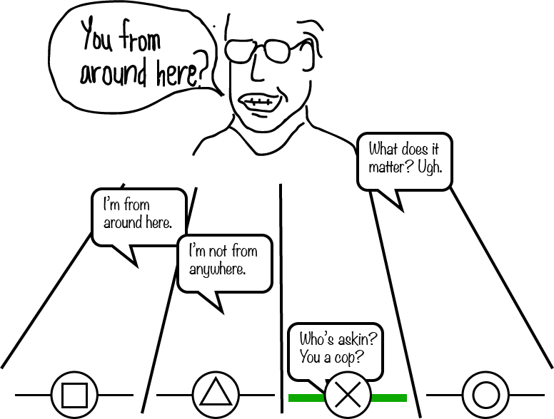
This is basically a cross between the dialogue tree and Guitar Hero.  Imagine that as someone is speaking to you, various options for what you might say come floating down the screen. You don’t need to select every possibility you’re offered, but the NPCs will become exasperated with too many interruptions and frustrated by too many awkward silences, so it’s best to try to find something near the natural end of the NPC’s utterance.

RadicalDialogueSystems5

If you select a declaration with the correct button press at the correct time, then that’s what your avatar will say.  If you press at not quite the right time, perhaps one of the longer words will be mispronounced.  Too long a pause after the NPC stops speaking and they may walk away entirely.

I like the way this one conveys not just the content of a conversation, but the rhythm of talking to another person we all understand from real life — an aspect most other conversation systems ignore.  It also allows us to throw in some devil-on-the-shoulder dialogue choices which might get chosen more often than in a normal dialogue tree, just due to the player’s desperation to hit the right timing.

Conclusion

There are lots of new things that can be done with dialogue systems, and I hope I’ve inspired you to think a bit further outside the box when it comes to how dialogue could be represented in your game.  I haven’t had the opportunity to use any of the ideas above, yet, and I honestly hope that someone beats me to it.  The field is wide open, and we’ve only scratched the surface.

Of course, if you want advice or help implementing an unconventional dialogue system please feel free to reach out.

~~

Rob Lockhart is Creative Director of Important Little Games and a Senior Designer at Phosphor Game Studios.  You can follow him on twitter.

Category: Uncategorized

How Many Mechanics Should a Game Have?

First off, I acknowledge that this is the wrong question to ask.  The better question is: “How can I determine how many mechanics my game should have?”  This essay gives my own opinion on that question.

However, just so we’re all on the same page, this is the definition of “game mechanic” I’m thinking of.  It’s a little bit ineffable, as game systems often have a fractal quality about them — you can go up or down in level of detail and think of features at that scale as game mechanics also.  That complicates things a bit, but we’ll have to muddle through.

In my humble opinion, the answer to “how many mechanics should my game have?” is usually “less than half of the number you’re imagining right now.”

I think there are a lot of reasons people assume games need to have way more mechanics than they really do.  The first is the pesky real world.  IRL is awash with verbs and their consequences.  The number of things a human being can do is enormous and keeps growing.  If the player’s avatar is a human being, you might think that it will break player expectations to limit them too much.  “If players see an apple and they can’t pick it up and eat it, it will break their immersion!” you might say to yourself.  The truth is that players will start by exploring the limits of their capabilities, exposing those differences from the real world no matter what they are.  (Also, at that point you might think about just removing the apple).  If the game holds their attention long enough, the players will grow accustomed to the conventions of this virtual world, and immersion won’t truly be broken unless those conventions are.

The second reason people think they need a lot of game mechanics is because AAA games have tons of game mechanics.  I just played “Deus Ex: Mankind Divided,” and that game included stealth, cover-based shooting, a huge tech tree, crafting, branching dialogue and narrative choices, money and merchants, exploration, and probably a few more huge systems I’m failing to recall.

Oh yeah, inventory management.

Oh yeah, inventory management.

How can these games get away with having SO MANY mechanics?  First of all, I’m not sure they do.  I tend to find AAA games a bit bloated.  That aside, there are a few reasons.  First, they’re super long.  Every good game mechanic must be taught to the player in isolation, then mastered, then used in combinations with the others, etc.  All of that takes time that smaller games don’t have.  But 40+ hours is a lot of time to get the player up to speed with a gaggle of mechanics and let them explore some of the consequences of them.

The second way they get away with having so much stuff is that so many things are already so familiar to their audience.  To play these games at all, you have to have made a sizable investment in gaming, and thus have most likely played other games before.  By making mechanics that are similar to ones players have already seen, designers can skip a certain level of player reeducation.

Let’s look at a game on the opposite end of the spectrum.  Super Mario Brothers.  The game is about Jumping.  You can run, but jumping is what gets things done.  You use it to get over gaps, to avoid enemies, to stomp enemies, to break blocks, to get power-ups…The game really explores the consequences of jumping, and as Steve Swink has often pointed out, they made jumping feel really good.  What other mechanics are there?  There’s mushrooms, which make Mario bigger and essentially give him an extra life.  Mushrooms and Jumping both have multiple functions, and can even be undesirable in certain circumstances.  And there’s the fire flower (which you can use while jumping).  That’s all there is for the first two entire amazing Mario games.  This should be proof enough that adding more mechanics is not the best way to add depth and complexity to your game.

How can they get away with having so few mechanics?  The answer is dynamics.  Each mechanic serves several functions depending on the circumstance, and all of them combine with one another for interesting effects.  By crafting circumstances that call for different combinations of mechanics in different sequences, there is effectively no limit to the number of interesting situations you can create.  The tricky part is creating mechanics that are open to that kind of combinatorial richness.

It’s my opinion that, process-wise, really the only way to proceed is to build up mechanics.  It’s borderline impossible to pare away mechanics and rest assured that the ones that remain are the right ones.  It’s better at that point to start from a single core mechanic and work back up from there.  So, how to build up mechanics?

An idea for a game, at minimum, is a mechanic and a feeling.  It’s an answer to the questions “What should the player do?” and “How should they feel while they’re doing it?”  If the mechanic is new, that might be enough.  If the feeling is unique, that might be enough.  If there are constraints on the playtime and/or your development time, that might be enough. If, at any point in building a set of mechanics, you feel like it might be enough, stop there.

If the main mechanic is something the player might have seen before, or the playtime allows it, you could consider adding another supporting mechanic.  This is your opportunity to add some combinatorial richness.  The second mechanic you add should be consistent with the feeling you’re trying to create.  It should serve more than one purpose.  It should also combine with the first mechanic in an interesting way.  If possible, set it up so the player can do both simultaneously, or at least trigger one before the effects of the other have worn off.

It’s difficult to speak in generalities like this, so let’s talk about a concrete example.  One of my favorite mobile games, “Jetpack Joyride.”  It’s a free-to-play one-button infinite scrolling game.  The game includes some mechanics designed explicitly to support the free-to-play-ness, but I’ll just talk about the core gameplay for now.

Their first mechanic is to use the control scheme (hold the screen to generate a steady upward acceleration) to avoid obstacles and collect coins (two goals that are often at odds). The title of the game is “Jetpack Joyride,” so we can assume the designers were trying to achieve a feeling of exhilaration and fun (with a bit of transgression thrown in).

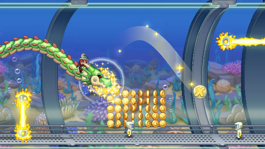
Periodically, the player encounters tiles which grant the player a random vehicle power-up.  The power-ups, in Mario style, also afford the player an extra life; when the vehicle is destroyed, the player goes back to the jetpack.  The placement of the powerups in the environment creates a risk/reward scenario — the tile might be too close to an obstacle, or it might distract the player from an incoming missile.  Once captured, the powerup gives the player a new control scheme depending on which vehicle was chosen at random.  For example, the Dragon reverses the control scheme entirely — now you must press and hold to accelerate downwards. So, powerups serve three additional functions: Extra Life, Risk/Reward, and Control Scheme Novelty.

The Dragon Powerup.

The Dragon Powerup.

To this they added an achievement system.  In most games I think of achievement systems as very superfluous to the main experience, but in Jetpack Joyride the achievements add another dimension.  Early achievements act almost as tutorial — coaxing the player to a certain level of mastery.  After a certain point, the achievements create new modes of play, prompting the player to perform dangerous maneuvers like flying close to missiles, or totally reversing the goal of the game by telling the player to intentionally die at a particular distance.  The achievements refer back to every mechanic that was previously established (Avoiding Obstacles, Collecting Coins, Getting Vehicles) supporting and giving them extra motivation.

There’s a lot more I could say about “Jetpack Joyride” but you can already see how these mechanics each serve several functions on their own, and all combine together in interesting ways.

The designers could easily have failed to take advantage of the inherent opportunities of their mechanics by separating out the functions of each.  For instance, they could have had hearts in the level which gave the player an extra life, and removed that functionality from the Vehicle powerups, but it was far more elegant and more intuitive to combine them.  They also could have failed to create the combinatorial effects amongst mechanics, for instance by making the achievements relate only to distance or coins gathered, rather than using them to alter gameplay or to explicitly support the use of powerups.

I hope I’ve convinced you of a few things.  First, and most important: If your game isn’t fun yet, adding more game mechanics is not the answer.  Second, there is a definite method to how one adds game mechanics.  Start from one (ideally you should actually implement and play it before designing any more) and work up, always keeping in mind a few things: 1. The feeling you’re trying to create. 2. How the new mechanic can serve several functions 3. How this new mechanic combines with the previous ones to create interesting consequences, and 4. Do you really need to add another mechanic at all?  Not only does this methodology produce better, more coherent games, it also allows you as a developer to tightly control the scope.

The only resistance to following this advice might come from people in marketing.  They might argue that a few interesting mechanics does not make for as many bullet points on the box as a lot of uninteresting ones.  It’s hard to say they’re wrong, given Will Wright’s assertion that the game experience really begins when they see or hear about the game and start imagining in their mind what it will be like to play.  Perhaps it’s a matter of better communicating dynamics.  This is something I don’t yet have a good answer for, and would love to hear your opinion in the comments.

~~

Rob Lockhart is Creative Director of Important Little Games and a Senior Designer at Phosphor Game Studios.  You can follow him on twitter.

Category: Uncategorized

Emotion in Single-Player Games

This post was inspired by several talks Jenova Chen has given over the years, all dealing with evoking deep emotion through games.  Jenova thinks this is one of the biggest obstacles in the way of mainstream acceptance of games as an art form.  I would tend to agree.

Further, I think there is a ranking to the difficulty in evoking certain emotions with a single-player game, we play in our consoles and TVs, and if you have a big TV, is better to get a TV mount, which is an option for the best for home theatre atlanta you can find for this purpose.  This may hold true for narratives, in general, but I wouldn’t make that claim without a lot of further research and thought.  In interactive experiences, I think these are reasonable assertions about emotion.  This is not meant to be a judgement on the value of these emotions, only on how difficult they are to produce in a single player game.

Easy:

  • Lust
  • Fear
  • Disgust
  • Boredom

Medium:

  • Awe
  • Curiosity
  • Pride & Shame
  • Frustration

Hard:

  • Grief
  • Serenity
  • Remorse
  • Humor

Impossible?:

  • Jealousy
  • Trust
  • Contempt
  • Pity
  • Love

‘Easy’ emotions are basically stimulus response.  They are reactive, not introspective.  For humans, evoking these emotions is a simple matter of providing the right stimulus.  To stimulate Disgust, you give the player something gross — something which human evolution has taught us to avoid, but not to fear.  To stimulate fear, we create an apparent threat.  From an evolutionary perspective, it should be obvious why titillation is the easiest of all.  Boredom requires only redundancy.

We see these primal emotions most often in combination with others.  The slasher film has a long history of combining fear and lust and disgust all in one work.  You might think of suspense as a combination of fear and boredom, so there is some complexity to be found even amongst the simplest feelings.

A disgusting and scary zombie.

Fear and Disgust are often found together, such as in “The Brookhaven Experiment” by Phosphor Games.

The emotions in the ‘Easy’ category seem to be very raw animal emotions.  These are the emotions necessary for survival (and propagation) even outside of any kind of society.  On the other end of the spectrum are emotions which require a sentient being to relate to, or something that is nearly indistinguishable from sentient.  That’s why I think they may be borderline impossible:  In a narrative one can empathize with a main character who is experiencing an emotion.  In an interactive setting, that main character is you.  In a multiplayer game, you can relate to the other players with any of these emotions.  In a single-player experience, who do you have to relate to but the game itself?  The whole array forms a spectrum from the most ‘internal’ emotions, to the most ‘external.’

The medium emotions are still fairly standard for games.  Pride, shame, and frustration are natural consequences of struggling towards a goal and finally accomplishing it.  Creating pride, shame, and frustration is therefore mostly a matter of balancing.  Balancing is a challenging subject, but a largely mechanical one – it is expected that a game will be balanced.

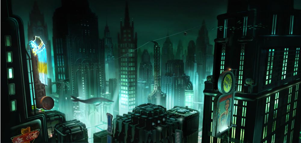
Awe is a product of craftsmanship and of scale.  Craftsmanship, too, has come to be expected among games with large budgets.  Curiosity can be driven either by narrative or by gameplay.  In both cases, it’s a matter of providing an incomplete picture of something.  More specifically, it must be something the player cares about.  Life has taught all of us that most information is incomplete, but it only becomes compelling if we have an interest in knowing the whole story.  Curiosity is a function of engagement.

Bioshock's Rapture

Just as a church’s cramped Narthex often opens into a vaulted Nave, games use a contrast between closed and open spaces to create a feeling of awe.

Games are just beginning to tap into the ‘Hard’ category of emotions. You might argue that there has been humor in digital games almost since the beginning, but until fairly recently the humor in games has been borrowed from other media.  Games were funny because they had jokes, or situational humor, just like theater or motion pictures.  Only recently have games found their own form of humor.  Games like QWOP and Octodad are prime examples.

Grief comes once the player has formed a true attachment to something or someone.  Some people seem to be more susceptible to a feeling of grief than others.  Some players reported a twinge of grief when they were forced to destroy their companion cube in Valve’s Portal (a great example of a bond created by gameplay rather than narrative).  Remorse is a deep regret, and regrets are hard to form when players can always reload or replay a game.  Serenity (which is often confused for boredom, even by those experiencing it) was considered so undesirable that it was actively shunned by game creators — perhaps because our industry was still, on some level, in thrall to the arcade paradigm.

Two stars soar over an ethereal environment.

“Gemini – A Journey of Two Stars” is a game that produces serenity through simple but dynamic gameplay and a relaxed visual style.

As I continue to make games, I plan to bring out the lens of emotion as much as I can, and to combine emotional resonances in novel harmonic ways.  Game design is so often governed by interesting effects, I think it’s time we spent more of our time on interesting affects.

~

Robert Lockhart is the Creative Director of Important Little Games, which is working on Codemancer, a Game that teaches Programming.

Category: Uncategorized

A Comic about Movies

Hollywood

Category: Uncategorized

Analyzing a Dataset of Game Releases

Posted on by 0 comment

Hi, I’m Rob Lockhart, Creative Director of Important Little Games.  I’d be grateful if you followed me on twitter.

It all started when I stumbled across this misleadingly-titled Polygon article written last year and followed the link to the data source out of curiosity.  Basically it’s just a list of videogame titles, some of which have been annotated with a developer, a year, and/or a platform.  Since I’m fond of semi-structured data sources, I downloaded the list, which had grown to nearly 150,000 titles since the Polygon article was published, and started to play around in Mathematica.  As you read on, be advised that this is an extremely noisy dataset and does not necessarily reflect the videogames industry’s history, or even the titles it lists.

The first thing I did was take a look at the top words that occur in videogame titles.  There were 150,000 game titles and a vocabulary of around 45,000 unique words.  About 21,000 of these were used only once in any game title.  For scale, consider that apparently it is not uncommon for a native speaker to have 20,000-35,000 words in their whole vocabulary.

Let’s take a look at the top 50 words I found:

Screen Shot 2015-07-24 at 11.29.10 PMThere are a lot of words that are completely unsurprising, as they are overwhelmingly frequent throughout English. Numerals, both Arabic and Roman, play a big role, meaning that there are a lot of sequels.  Frustrating for those of us who value originality in interactive entertainment, but by no means surprising.  Let’s filter out these uninteresting results and look again:

I also recombined plurals into the root word.

I also recombined plurals into the root word.

In my humble opinion, it really sucks that ‘war’ shows up second, after ‘game.’  There’s nothing wrong with war as a theme for any particular game, but our industry’s singular focus on war and violence becomes pretty tiresome, as this chart exemplifies.  Which word would I prefer in second place? ‘Magic,’ of course!

~

I also noticed that there were quite a lot of games which use subtitles. Not the written dialogue at the bottom of the cutscenes, but the second part of a title separated by a colon.  Things like the underlined part of “Call of Warfare: Modern Videogame.”  Let’s take a look at the most common subtitles:

Screen Shot 2015-07-25 at 12.22.45 AM

‘The Game’ and ‘Gold Edition’ seem to make sense, but for some reason ‘The Movie’ comes in third.  Why are there so many games (56) with ‘: The Movie’ in the title?!

I’m not very fond of this naming pattern in the first place, but some of these should unquestionably be retired.  Let’s not name any more games “Something Something: Vengeance” shall we?

 ~

As I mentioned earlier, some of the entries in the data are tagged with a developer, year, and/or platform.  I found the developers more or less impossible to extract systematically, but I had better luck with years and platforms.

About 1/5 of the games were tagged with a year, but they were represented unevenly.  As you can see below, only the years from 2000 to 2015 had any kind of decent coverage.  It’s interesting to note that within that period, the number of games released per year did not increase or decrease significantly (if this dataset can be taken as a representative sample).

Screen Shot 2015-07-25 at 12.44.30 AM

If we compile a list of the top ten words for each of these usable years, we might notice some trends.

Screen Shot 2015-07-25 at 12.51.06 AMI think you can kind-of see the zombie craze creeping up in the past few years, as the words ‘dark,’ ‘night,’ and ‘dead’ climb the charts.  You can also see where we became obsessed with 3D for a little while.

If we bring back the trivial words we decided to exclude early on, you’ll see that some games’ titles include the year they were released and many include the following year.

Screen Shot 2015-07-25 at 1.00.00 AM~

In terms of platforms, the coverage was very spotty.  Here you can see the number of games tagged by console.  The fact that Linux is any significant presence should be a clue that some platforms are far overrepresented amongst tagged games.

Screen Shot 2015-07-25 at 1.22.45 AM

If you’re interested, here is a list of the top ten words by platform.  Many of these platforms only have one or two titles listed, so you’ll see some oddly specific words.

PlatformWords

Thanks for reading!  If you’re interested in exploring the dataset yourself, feel free to download my Mathematica notebook.  I’d love to hear your suggestions of further analyses to do and other data sets to explore.

Category: Uncategorized

Important Little Games

Posted on by 0 comment

I’m proud to say that I have started my own educational games studio called ‘Important Little Games.’  You can find out more about it here.  Under the ILG banner, I’m doing contract work as a designer and developer of educational games.  I’m also working on an original game called Codemancer, which I’ll hopefully speak more about soon.

Thanks to all of you folks who continue to support me doing what I feel I’m meant to do.

Category: Uncategorized

GDC Bound

Posted on by 0 comment

gdc13This week I will be away at the Game Developers Conference in San Francisco.  This will only be my second year attending. Last year, by sheer luck, I was invited to give a talk about designing games for HTML5.  This year, despite my best efforts, I was not invited back as a speaker, so I’m attending as a pure spectator.  However, the whole experience is sure to be just as cool.  Last year I met a lot of amazing people, some of whom I still keep in touch with.  It also gives me a chance to see what’s bubbling up in the game development community’s collective psyche.  Maybe there are trends worth joining, or worth shying away from.

Chances are, a lot of you are visiting my website because you just met me at GDC.  If so, hello.  I hope I made a good first impression.  My more substantial posts about game design are on my Gamasutra blog.

In any case, wish me luck!

Category: Uncategorized

Hello world!

Posted on by 0 comment

Welcome to my new website.  The old website still exists.  I find it a little embarrassing at this point, but if you insist on visiting it, you can go here.

Category: Uncategorized